05: Taste, branding and designing non-average products in a noisy AI world (w/ Meylin)
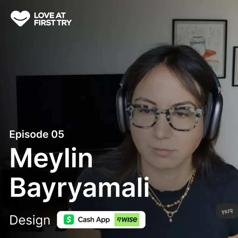
Your SaaS design might be functional, loved by customers… and still too shy to stand out. That was Wise before their rebrand.In this episode I’m talking with product designer Meylin Bayryamali, who’s worked on global products at Wise and now Cash App.We dig into how she thinks about taste, why she started DJing to escape the Figma bubble, and how that led into one of the most interesting fintech rebrands of the last decade. We also talk about design process, research that actually ships, and how her team uses AI in a way that raises the quality bar instead of lowering it.If you’re a SaaS founder or someone leading product in a “serious” space (fintech, ops, B2B), this one will give you a very practical way to think about taste, branding and AI without the hype.🧠 What you’ll learn:00:45 – Meylin’s story from agency life to Wise and Cash App02:57 – What “taste” means to her and why average is the real enemy04:40 – How DJing and music unlocked better product taste than staring at Figm08:20 – Inside Wise’s rebrand and the moment customers loved the product but not the look10:25 – Why tone of voice and culture mattered more than just new visuals12:14 – Working with an external agency without losing in-house ownership16:52 – The origin story of Wise’s tapestry visuals and the “lost art” of banknotes21:12 – Balancing growth and delight when time is always the constraint24:26 – How projects are scoped and shipped without rigid sprints27:32 – Wise’s approach to research: when to talk to customers vs when to measure33:06 – Why LinkedIn is a terrible place for design advice and how to avoid bad taste36:16 – Very practical ways Cash App uses AI to speed up quality work38:36 – Using AI imagery to sell an idea internally and get branding support41:35 – Why Bump is her current favorite product and what it says about committing to a strong style42:47 – Closing the loop on taste: good, bad, but never in the middle💡 Steal these quick wins:1/ Use “good or bad, but never average” as a design filter.Before you ship a flow or a page, ask: *does this have any point of view or could it belong to any competitor?*Why it’s worth it: this one question forces you to add at least one bold decision — in layout, copy, or visuals — that makes your product memorable.2/ Stop looking at SaaS to design more SaaS.Build a habit around non-digital inputs: art, photography, music, architecture, film. Treat it as part of your design work, not a hobby.Why it’s worth it: you stop recycling the same rounded cards + gradients as everyone else and start importing ideas from places your competitors don’t look.3/ Pick research methods to match the project, not the playbook.For big direction changes (like a new home screen), talk to customers directly and roll out gradually instead of over-optimizing surveys. For mature flows, use more quantitative research to tweak.Why it’s worth it: you save time on “performative research” and only dig deep where the upside is huge.4/ Use AI to kill boring ops, not your taste.Start with one workflow where your team wastes time (like sorting bug reports or drafting visual directions), and use AI to speed that up — while humans still decide what “good” looks like.Why it’s worth it: you free up hours that can go into craft, details, and better decisions instead of ticket admin.5/ Prototype vibes, not just flows.For ideas that need a strong identity, generate one or two AI images that capture the feeling you’re after before the brand team is even involved.Why it’s worth it: “seeing is believing” — visual vibes get stakeholders excited and pull branding partners in faster than decks and documents.
